User Testing & High-Fidelity Prototype
Through the user testing, I discovered 3 major findings and made improvements.
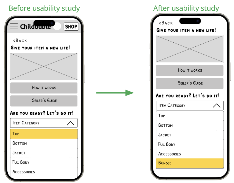
1. Bundle selling/shopping option
“Usually when I use other similar app, there is ‘bundle’ option. When you clear out over grown clothes, selling one by one is kinda too much work.”
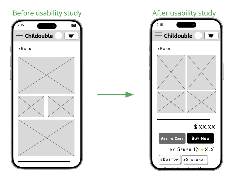
2. Improve Item Information page
Participants experienced confusion when attempting to purchase the item because the 'buy' button was not immediately visible upon opening the item information page. To address this issue, I reorganized the page layout to ensure that the 'buy/add to cart' button is prominently displayed without requiring users to scroll down.
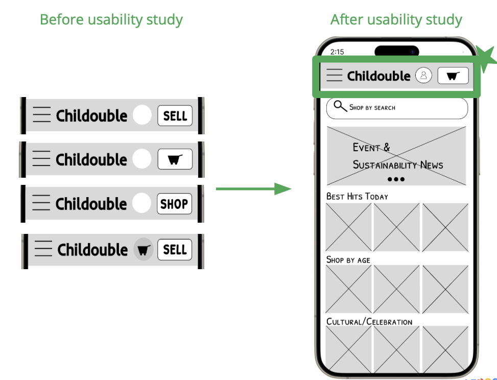
3. Consolidate Sell/Cart/Shop Botton on the top bar
““They gotta do something with this button. It’s keep changing - it was ‘sell’ at one point and now it’s ‘shop’. It’s confusing.”
With the improvements, making mockups with typography, colors, iconography and other design elements.